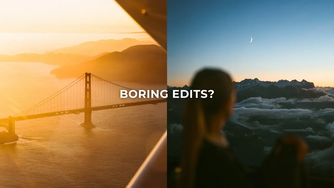
Stop Editing Your Photos Like This (6 Photo Editing Mistakes)
Lightroom
Editing is where you give a photo your visual signature. Here are six common photo editing mistakes I see that stop photos from standing out online, and how to fix them.
·
10 min read

There's a lot that goes into capturing beautiful photos, and I talk a lot about the act of going out and shooting. But editing is also an incredibly important part of the creative process. It's where we polish the photo and give it our visual signature before we share it with the world.
So in this post, I'm breaking down some common photo editing mistakes that might be keeping your photos from standing out online, plus a few pro editing tips.
Before we start: editing is completely subjective, and you might not agree with everything here, which is totally okay. Photography is a subjective art form. There's no right or wrong, so go with what you think looks best. These are just mistakes I see a lot that I don't think look great. Let's go!
READ OR WATCH: This blog post is also available in video form! If you'd rather watch me explain this content, simply watch the video below. Otherwise you can find the text guide below. Just keep scrolling!
In Stop editing your photos like this, I show examples of each mistake in Lightroom.
6 photo editing mistakes to stop making
1. Over-styling your edits
The first mistake I see a lot is over-styling an edit, or forcing an edit onto a photo where it just doesn't mesh and doesn't look natural.
Stylized edits look good, and a lot of my photos are quite stylized. I like to really pull the colors out and make them pop. But there's a limit. You don't want to push an edit so far that the photo starts falling apart, you get banding in the sky, or it looks nothing like real life. I see this a lot when people push new colors into a photo with the Color Grading panel, or shift the hues so far they're nowhere close to reality.
Don't force one style on every location. Where I see this mistake most is photographers trying to edit photos from all around the world in one single style. Many of us want a consistent visual signature, and one easy way to get it is to edit everything the same way. But if you shoot a wide range of subject matter, that's really hard to pull off.
For example, a photographer absolutely nails the edit for their Bali photos and turns it into a preset that looks epic on everything they shot there. Then they go to Norway, use the same preset, and it doesn't work at all. The colors and tones are completely different, and it's just not the right style for that environment. That's what I mean by forcing a style onto a photo.
It's really important to edit for the location you're shooting. My edits in Bali are completely different from my edits in Italy. I do like visual consistency, but it doesn't come from slapping one preset across all my images. I edit each location separately and add small visual cues so they look good as a group. (I go deeper on this in why your travel photos are disappointing.)

Turn down your presets. A lot of photographers make this mistake through presets. I have nothing against presets, I use them all the time. But a lot of presets are quite strong. A good preset should give you a strength slider after you apply it, so you can drag it down if the look is too much. Don't forget about that feature.

2. Too much sharpening and clarity
This is really common with beginners. I used to do it too. When I look back at my old photos, there's so much clarity going on, because it looks cool. It's not something we can usually do with our phones, so when we pick up our first camera, the Clarity slider looks absolutely dope. I get it.
But there's nothing worse than a photo that's too sharp. Too much clarity pulls focus away from what's actually important, and your eye doesn't know where to look. I like to tone down the clarity in my photos, so the focus is on the shapes and composition rather than every little detail. But you can take that too far too. Drag the Clarity slider all the way down and it looks too extreme. Editing is all about balance: pushing things enough to look stylized, without the photo falling apart or looking ridiculous.
How I use clarity. I reduce the global clarity by around -15 to -20. Then I create a new mask, select my subject, and bring the clarity back up on just them. So the subject sits at zero, the rest of the image is softer, and it isn't extreme. It helps you focus on what's most important: your subject.
A dreamy, glowing film look. If you want that glowing film look a lot of photographers are chasing, and you don't have a Pro-Mist filter, you can do it in Lightroom. Instead of lowering clarity globally, target just the highlights. Open the masking panel, add a luminance range mask, click on the brightest area of your image and refine the range so it only targets the brightest parts. Then bring the clarity down a little to add some bloom. I like this approach because it looks much closer to real film halation, which affects the highlights rather than the darker areas.

3. Not enough color contrast
Contrast is the difference between the brightest and darkest areas of a photo. Color contrast is the same idea for color: the differences in hue, saturation and luminance between the colors in your image. It just looks really good. Instead of one color dominating your image, pulling the colors apart a little adds a ton of visual interest.
Sometimes it's as simple as changing the hue of one color. I absolutely loved this photo, but after editing it, I noticed the greens were a little too strong. I wanted to bring some browner, orange tones into the foreground to create some color contrast. All I did was go to the HSL sliders and drag the yellow hue slider to the left a little. That brought a lot more warmth into the foreground, and the brownish areas really stood out against the greener areas. One small adjustment, and it looks so much better.

Changing the hue isn't the only way. Depending on the image, you might need to adjust the saturation or luminance of a color instead. Play around with the Color Mixer and check the hue, saturation and luminance of every color.
Bonus points if you can increase color contrast and achieve color harmony at the same time. Color harmony is how colors relate and how they look together to us. Some colors just look really good together, like a blue sky and a warm beach. (I go much deeper on this in color theory for photographers.)
4. Not using selective adjustments
Selective adjustments are insanely powerful. They let you pull a photo apart and edit different parts of the image separately. If you're just getting started in Lightroom and aren't sure how to use them, just give them a shot: open them up and try editing one specific part of your image.
I use them like crazy. I do a lot of dodging and burning, darkening the dark areas and brightening the bright areas, which is a classic photography technique. I also use them to play with color and texture, like reducing clarity in certain areas, or warming or cooling specific parts of the photo. If you only use global adjustments, you're selling yourself short, especially on harder edits.
My favorite, and probably the most underused, are the luminance and color range masks. They let you select a very specific brightness or a very specific shade of color, and edit just that small selection to fine-tune the light or color. (Here's the Lightroom masking trick pros use on every edit.)

5. Pushing the HDR look too far
I see this with beginners, and also with photographers who've been in the game for a while: pushing the HDR look too far.

When you start learning photography, you'll read that you should always keep some detail in the highlights and blacks, and never clip information. My response is that there's no reason you can't completely blow out the sky or completely crush the blacks. Photography is an art form, and you can do whatever you want with your image.
I actually don't love that advice, because when people open their editing software, the first thing they do is drop the highlights and lift the shadows. That makes the photo look super HDR and unrealistic, and so overly detailed that it's hard to know where to look, because everything is exposed to the max. It also completely nukes skin tones and can make someone look about 30 years older.
So be careful lifting shadows and blacks, or pulling down highlights and whites. We do like some detail, but you don't have to keep all of it. When I'm editing a really high-contrast scene, I'm very cautious with those sliders. It's totally fine to lose some detail if it makes the image look better and more compelling. (More on this in how to shoot in harsh midday light.)
6. Awkward cropping
I mean this in two ways.
Unusual aspect ratios. The first is cropping photos into aspect ratios that don't really make sense. I usually recommend sticking with traditional aspect ratios. For landscape orientation, 2:3 (or 3:2), 16:9 or 16:10. For portrait orientation, 4:5, 8.5x11, or whatever your camera spits out by default. A lot of photographers crop into squares or other awkward ratios that aren't common in photography. There's nothing wrong with that, and if that's what you're after, do whatever you want. But if you're trying to make your photo stand out, I'd stick to the traditional ones, because that's what people are used to seeing.
Cropping too tight. The second is cropping in a normal ratio, but in an awkward way, and the biggest version of this is not letting your subject breathe. Negative space is just as important as positive space in photography. Empty parts of the image give your subject room and context, and make for a cleaner composition. So instead of cropping right above someone's head, let them breathe in the frame.
As a photography teacher, I look at a lot of beginners' photos, and cropping too tight is probably the biggest editing mistake I see. So when you're out shooting, don't shoot for the crop. Shoot exactly how you want the final photo to look. That's how I shoot, and honestly, I don't crop much when I edit.

So, how do you stop making these photo editing mistakes?
Don't push your style so far that it breaks, and edit for each location instead of forcing one look on everything. Go easy on clarity and sharpening. Pull your colors apart for more color contrast. Use selective adjustments. Don't be afraid to lose a little detail instead of going full HDR. And crop with traditional ratios, giving your subject room to breathe.
There are plenty of other editing mistakes I see, but these are the big ones that I think hold photos back the most. Let me know in the comments on the video if you want a follow-up. And for a step-by-step approach, here's my Lightroom editing workflow.
Happy editing!
Want to edit with more confidence? My Lightroom Masterclass has over five hours of super detailed editing lessons, breaking down not only how to use every single slider in Lightroom, but why you'd make each adjustment to your photos.


Sean Dalton
Made with ☕ and a camera.