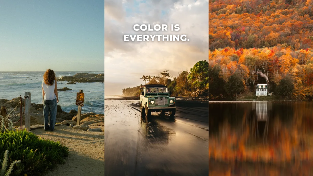
Color Theory That Photographers Need to Know
Lightroom
Color shapes not just how a photo looks, but how it feels. Here's the color theory every photographer should know, plus the Lightroom tips I use to edit color in my own photos.
·
12 min read

Color is probably the thing I spend the most time on when I'm editing my photos. I've stared at images for 5, 6, 7 hours, dialing in the colors and trying to get them perfect. That's because color has a massive impact on a photo: not just the aesthetic, but more importantly, the mood, story or feeling you're trying to express.
Color is also a little difficult to master, especially in the editing phase, where we really dial in and shift colors to get them looking how we want. So in this post, I'm doing a deep dive into color theory for photography: how to harness, shape and manipulate color to tell deeper stories, plus some key Lightroom editing tips. Let's go!
READ OR WATCH: This blog post is also available in video form! If you'd rather watch me explain this content, simply watch the video below. Otherwise you can find the text guide below. Just keep scrolling!
In Color Theory that Photographers Need to Know, I show the before and after edits for every photo in this post.
The foundations of color theory in photography
Let's start with the foundational principles of color you need to understand as a photographer.

The anatomy of color. Every color is made up of three things: hue, saturation and luminance.
Hue is the actual color you're working with: green, blue, yellow, orange, pink, purple and so on.
Saturation is the purity or intensity of a color. A more saturated color is a purer, stronger, more intense version of that hue. Desaturate it, and it becomes more muted, softer and less pure.
Luminance is the brightness of a color. Add white to a color and it gets brighter, and less saturated. Add black and it gets darker, and more saturated. That's exactly why, when you add contrast to an image, the colors often get more saturated too.
The reason I start here is that you can edit all three of these independently, for each color, in Lightroom or pretty much any editing software. More on that later.
Temperature. Temperature refers to whether colors are warmer or cooler. Warmer colors lean orange or yellow, and cooler colors lean blue or purple. Adjusting the temperature of a photo has a massive impact on how it looks and feels.
Color space. For digital photography, the color model is RGB: our cameras capture red, green and blue light and combine them to reproduce a broad range of colors. That's why red, green and blue are the main colors you see in Lightroom's color tools and tone curve. That part is good to know but not essential.
What is essential is that within RGB there are different color spaces, and the two most popular are Adobe RGB and sRGB. Adobe RGB has a wider color gamut, so you can capture and edit more colors, but it isn't compatible with most screens around the world. sRGB was designed specifically for screens, digital photos and printing. So for the most compatible photos, shoot and export in sRGB. Your camera is probably set to sRGB already, but make sure your export settings are too. If you upload an Adobe RGB photo online, it gets converted to sRGB automatically, and your colors and contrast can end up looking super wonky.
The psychology of color
Color is highly associated with emotion. This depends a lot on your cultural background and life experiences, but generally speaking, most people feel something similar when they see certain colors. Green is associated with nature, wealth or trust. Blue feels natural and calming. Warmer colors feel fierce, energetic and strong.
This matters so much for photographers because we can enhance certain colors to express much stronger emotion in a photo.
Lean into a warm sunset. Pull those colors out and enhance them to emphasize a warm, powerful, dramatic sunset. I often do this with the temperature sliders.
Lean into nostalgia. If a photo already has a nostalgic vibe, add warmer tones with the Color Grading panel to really emphasize that vintage, old-school look.
Lean into moodiness. If a shot is moody and solemn to begin with, lean into cooler, bluer tones to emphasize feelings of isolation or solemnness.

So yes, we're manipulating colors to make an image look better, but more importantly, we're using color to tell a stronger story. (I go much deeper on that in how to tell a story with your photos.)
Color harmony
The aesthetics of color still matter a lot, and there's one more thing we need to pay attention to: color harmony. Color harmony is the relationship between colors, and how they look to us together. Some colors just look really nice together, like blue and orange, red and green, or yellow and purple.
A great way to visualize this is Adobe Color, a free color wheel tool. It lets you choose different color harmony rules and see how colors relate. There are three main harmonies we come across in photography.
Analogous colors. Three or more hues fanned out equally from a middle color. With orange in the middle, that's the range from yellows to reds. With blue, it's purples to cyans. Analogous color schemes are common in nature: sunsets, forests, bodies of water. This sunrise I shot in Kintamani, Bali has an analogous scheme of deep blues, greens and golds, and this shot of light rays spilling over a road in Bali is mostly greens, yellows and oranges at different brightnesses.

Monochromatic colors. One hue at different luminance levels. Think of a really warm or really cool scene, like a sunset, the ocean or blue hour. I use this one the most, because it lets me lean into one key color and the emotion behind it. I use it most at sunrise or sunset, when the temperature is already skewed, like this photo of my friend on the California coast, which is dramatically warm, so I focused on bringing out those warm orange tones. Or this sunset at Morro Bay, which is all different luminance values of pinks and warm tones. Or a sunrise in Bali, where I wanted to emphasize a cool, steamy morning jungle, so I leaned into the blues.

I also use it when I want one specific color to shine, like this photo of Kelsey in Bali, where I really wanted to emphasize the cool blues, or this shot of my friend Mike in Madeira, where I wanted cool tones to make the image super moody.

Complementary colors. Colors opposite each other on the color wheel. These are well known and very naturally occurring, like a blue sky against a warm beach, or a red flower against its green stem. The most popular combination in cinema is orange and teal, because orange looks great in skin tones, and blue in the background or shadows complements those warm skin tones.
Complementary colors also introduce color contrast, the differences between the colors in your photo, which adds a ton of visual interest and makes the colors more appealing. When I'm editing an image with multiple colors, I'm almost always trying to shift them to be more complementary.
Sometimes that's as easy as sliding one hue slider to pull the colors apart a little. In one photo, I dragged the orange hue slider to the left to make it slightly more orange-pink, which complements the greens and blue sky much better than the yellow it was before.
Other times it takes more work. In another image, I added a linear gradient mask over the foreground and warmed it up with the temperature slider to balance the sky. In another, I used masking to enhance the deep blues so they'd complement the warmth of Kelsey's skin.
I'd recommend playing around in Adobe Color. You can even upload a photo and extract its color theme. Color harmony can be hard to get your head around, but the more you shoot and edit, the more you get a feel for which colors look good together.
Lightroom color editing tips
Knowing which colors look good together is one thing. Knowing how to actually get that look in Lightroom is another. Here are the tips I use on my own photos.
Start with how you want the photo to feel. One thing I hear most from beginners is that they open a photo and don't know where to start, especially with color. The most important question you can ask is: how do I want this photo to look, and more importantly, how do I want it to feel? Then look at the colors in the image and think about how to accentuate, enhance or desaturate them to get that mood across. That's hands down the first thing I do when I edit. If it's a warm sunset, you bet I'm leaning into those warm tones. If it's a moody, solemn day, I'm pulling out the warmer colors and emphasizing the cooler ones.
I shot a photo in the small town of Stowe, Vermont, and I remember the place being so warm. The leaves were on fire: all I could see was orange, yellow, red and pink. When I opened the photo to edit, it looked nothing like that. It was incredibly flat. So I asked myself what I could do to bring back that cozy, warm vibe I'd witnessed. I pulled the colors back out with the HSL sliders and the Color Grading panel, plus the Dehaze slider to cut through the haze over the lake. I knew the look I wanted before I touched any of the color. I do this with so many of my images, like a surfer I shot on the coast of France, where I leaned into the warm tones, or a sunrise in California, where I let the colors in the sky and foreground carry the story.

There's no one right way to get a look. Lightroom has a lot of color tools: the HSL sliders, the tone curve, Point Color, the temperature and tint sliders, Calibration, the Color Grading panel, and even contrast adjustments affect color. Some images are easy, and you might only need temperature, tint, vibrance and saturation in the Basic panel. That's all I did for this sunset at Morro Bay, because I already liked the colors in the scene. Other images need every tool.
If you're struggling, work your way through each tool and experiment. Drag each HSL slider all the way left and all the way right and see what it does to your image. Do the same in the Color Grading panel and with the temperature sliders. Every image is different. Eventually you'll find the tool that gives you the look you want. (Here's my full Lightroom editing workflow if you want a starting point.)

Use the Color Grading panel. It's massively powerful and underused. It lets you add color to specific tonal ranges of your image (shadows, midtones or highlights) and choose a very specific color. A lot of the time, instead of using the temperature slider to warm or cool an image, I do it in Color Grading, because I have so much more control over where that color goes, and I'm not limited to just orange and blue. It adds so much color depth, and it's helped me take a lot of originally boring images and add emotion and drama. (I go deeper in the trick to perfect color grades in Lightroom.)
Use the masking tools. If I could only use one tool to edit color, it would be masking, because it gives you so much control over specific parts of your image. You can use radial and linear gradients, plus color and luminance range masks. Back to that California sunrise: with the masks turned off, it's a nice photo. With them on, it really comes alive. I selected the sky and enhanced the tint and saturation, reduced the highlights a little to make the colors pop, and used a luminance range mask on the shadows to add warmth that complements the cool sky.

Another example is a photo from Italy, where I used a color range mask to select the warmer parts of the image and warmed them up even more to emphasize the complementary relationship between the blues and oranges. I also pulled the whites down a little to flatten it out and give it a nostalgic film vibe. Most of the time, when I'm editing color with masks, I'm just adjusting temperature, tint, saturation and maybe a bit of luminance. If you need to be more specific, you can use the hue adjustment or Point Color, which gives you crazy control. (More in the Lightroom masking trick pros use on every edit.)
Take breaks. Color fatigue is real. When you stare at a photo for a long time, the colors might look good to you, but take a break, come back, and I almost guarantee they'll look weird and funky. I very rarely edit color in one go. I get the colors to a point where I think they look good, take a break, come back, and they never look good. Your eyes get tired and you become a little color blind. Sometimes it takes me five or six rounds to nail the colors before I share or print an image.
So, how do you get better at color in photography?
Learning to see and work with color can be daunting. I really struggled with it when I started out. Now it's probably one of the most defining features of my work, and the thing I spend the most time on when I edit. Learn the anatomy of color, use color psychology to support the story, aim for color harmony, start every edit by asking how you want the photo to feel, and take breaks.
I hope this gives you a mental workflow you can follow when you edit color in your own photos. If you want to see more editing breakdowns, let me know in the comments on the video.
Happy editing!
Want to go deeper on editing color? My Lightroom Masterclass expands on everything in this post, with over five hours of step-by-step lessons, including a few of the photos in this post.


Sean Dalton
Made with ☕ and a camera.