The Trick to Perfect Color Grades in Lightroom
Lightroom
Natural, cinematic color in every edit.
·
13 min read

Color is one of those things that can completely change the way a photo feels. When it's done right, it can add a ton of emotion and feeling to an image. But when it's off, your photo can start to look a bit funky and unnatural.
In this post, I'm going to show you exactly how I approach color grading in Lightroom. I'll cover everything you need to know to get natural, cinematic looking colors in your photos, the three color strategies I use the most, and a few tips that will take your edits to the next level. Let's go!
READ OR WATCH: This blog post is also available in video form! If you'd rather watch me explain this content, simply watch the video below. Otherwise you can find the text guide below. Just keep scrolling!
In The Trick to Perfect Color Grades in Lightroom, you can watch me color grade every one of these photos from start to finish.
Start With White Balance
When we talk about color grading in Lightroom, of course we're talking about the Color Grading panel. But you shouldn't even be touching that panel until you've set a foundation of color for your image. You do that with the Temperature and Tint sliders in the Basic panel.
This is the first place I always start when I'm editing color, because it lets you establish a general mood for the photo that you can then build on with the color grading tools. They're also incredibly easy to understand. Drag the temperature slider to the right and the image gets warmer. Drag it to the left and it gets cooler. Tint works the same way, but between green and magenta. Together, these two sliders set the white balance of your photo.
Ideally, you want to start your edit with the white balance as balanced as possible, so you can add creative color over the top with the Color Grading panel. With that said, I also like to use white balance creatively. There's no correct white balance you have to start your edit at, and sometimes I lean a little warm or a little cool depending on the overall vibe of the photo. If you shot in auto white balance, your camera probably did a fantastic job of balancing the scene. If not, click Auto next to the white balance sliders, and chances are Lightroom will pick a pretty accurate white balance for your image.

How the Color Grading Panel Works
Now that you have your color foundation, it's time to move on to the Color Grading panel. The difference between this panel and all the other color tools in Lightroom is that it lets you add colors into your image, instead of editing colors that are already there. And it adds that color into different tonal ranges of your photo.
In its default view, you'll see three circles, and each one targets a different tonal range. Shadows targets the shadowed areas of your image, Highlights targets the highlights, and Midtones targets the middle (or gray) part of your image. For each one, you can control the hue (the actual color itself), the saturation (the purity of that color) and the luminance (the brightness of that color). Click and drag inside a wheel to introduce color into that tonal range. Move further from the center to increase saturation, and move around the circle to pick a different hue.

One thing you might notice is that pure black isn't affected at all when you add color to the shadows. That's because there's no light in black that can be edited, so black stays black. But if you drag the luminance slider under the shadows wheel to the right, you add gray into those blacks. Now they count as shadows, and they pick up your shadow color. The highlights work the same way. Add some pink to the highlights and the pure whites won't change, but bring the highlight luminance down and you'll see pink show up in the brightest areas of the image.
These black and white levels are also affected by other adjustments in Lightroom, not just the Color Grading panel. If you lift the black point or pull down the highlights in the Tone Curve, those areas start picking up color too. Nothing really exists on its own in Lightroom, which is why I think it's so important to learn how all of the tools work together. If you want to learn how every slider works and how it all ties together, that's exactly what my Lightroom Masterclass covers.
Below the wheels you have two more sliders:
Blending smooths out the transition between the colors in your photo. Drag it right for a smoother gradient, or left to make the changes a little more abrupt. It's different on every photo, so I like to add my colors first, then play with blending and see how it looks.
Balance favors your highlight color when you drag it to the right, and your shadow color when you drag it to the left. Just like blending, sometimes it looks better one way and sometimes the other. You just need to experiment a little.
At the top of the panel, you can also open each wheel on its own. This gives you a much bigger circle, which makes it a lot easier to find the perfect color, plus individual sliders for hue, saturation and luminance if you'd rather work with sliders. There's also a Global wheel, which adds color over your entire image. It's great if you really want to lean into a certain color, or the temperature sliders just aren't doing it for you.
Color Grading vs. HSL
Okay, so why use color grading when you have other great color tools in Lightroom, like the HSL sliders or Point Color? Like I said, the Color Grading panel lets you add color into specific tonal ranges of your photo: the highlights, the shadows and the midtones. The HSL sliders only let you edit colors that are already in your image. If there's no red in the photo, pushing the red saturation slider won't do anything. You have to add that color in with the Color Grading panel for it to show up.
The HSL sliders also don't affect color you add with the Color Grading panel. Add some red with a color grade, then push red saturation in the HSL panel, and nothing happens. The Color Grading panel kind of sits on top of the edit and isn't affected by the other color adjustments in Lightroom. That's why a lot of photographers will tell you to dial in your color with the HSL sliders first and color grade after. Personally, I don't think there's any strict order you need to follow here. I often find myself working back and forth between the Color Grading panel and the HSL sliders to really get my color dialed in.

Strategy 1: Complementary Colors
Now let's see this system in action. The first color strategy is to use two colors that sit opposite each other on the color wheel, also called complementary colors. This is where we start getting into color theory a little bit. I won't go too in depth here, because I already made a super detailed tutorial on color theory you can check out after this post. But in short, some colors just look really, really good together.
The easiest way to find complementary colors is with a color wheel, and Adobe has one. Go to Adobe Color, choose Complementary under color harmonies, and drag the points around the circle. It always selects the opposite color, and it works exactly like the wheels in Lightroom's Color Grading panel.

Some of the most common combinations you'll see in photography are blue and orange, green and red, and at night you can start playing with some really unique colors, like purple and green. Blue and orange is probably the most common, and I use it in so many of my images because it's incredibly pleasing to the eye. It's also naturally occurring, so a lot of scenes already have these complementary colors built in, and color grading lets you enhance them even more.
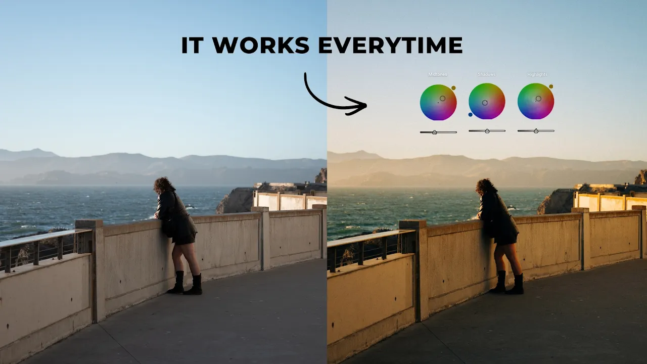
On this photo I shot in California, I'd already done some basic adjustments to give it a bit of a film look, and set the white balance at a pretty balanced point, maybe a little toward the warm side. In the Color Grading panel, I added some blue into the shadows. On its own, that makes the image look a little cool, so I balanced it out by adding warm tones into the highlights. Then, because the image has a lot of midtones, I added some warmth there too. I typically love adding warmth into the midtones, especially when I'm adding blues into the shadows. I wanted a little more blue in the sky, so I bumped the saturation on the shadows, smoothed out the blending, and pushed the balance a bit warmer to really get that classic California film vibe across.

The scene already had a lot of complementary color in it, but the color grade really enhances those colors and the overall vibe of the photo.
This blue and orange combo really comes to life when you're shooting at night, because there are a lot more shadows you can add color into, and I personally love adding blues into those shadows. On this abstract photo I shot in Hong Kong, I could play with color a little more than usual. I added blues into the shadows, which cools the image down quite a bit, and those darker areas just look so, so cool. To balance it out, I added warmer yellows and oranges into the highlights, a bit more orange into the midtones, and bumped the saturation on the warm colors (and the blue) to bring a lot more color back into the image. Then I smoothed out the blending and leaned the balance a little warm. Two of the presets in my Film Vibes Preset Pack have this exact grade built in, made specifically for night photos, and I use them to edit so many of my night images.

Green and red is the other complementary combination I use a lot. It isn't entirely natural like blue and orange, but it gives your images a classic Fujifilm aesthetic, and I love that look, especially in photos that already have some green in them. On this alleyway photo, I added just a little green into the shadows, then some pink into the highlights to balance it out. It's really subtle, but it makes the image a lot more pleasing, with a lot more color depth. It's a really simple adjustment, and the image is so much more interesting for it.

Strategy 2: Go All In on One Color
The second strategy is to go all in on one color, or a few very similar colors. On the Adobe color wheel, the monochromatic scheme picks one hue at different luminance values. The analogous scheme is very similar (so I like to group them together): it picks colors that sit very close to each other on the wheel. Either way, you're really leaning into one color family to emphasize the vibe of that color in your photo.
On a photo I shot in Vermont, I'd already played with the colors a little, and it was looking nice, but it lacked color depth and I really wanted to bring out the warmer autumn tones. You can do that a few different ways. You can add warmth with the Global wheel, which honestly looks really, really good. Or you can add slight variations of warmth across all three tonal ranges: some warmth in the highlights, a bit more yellow or orange in the shadows, and some yellow or orange in the midtones (maybe even a little green if you want to). That's right on the line between monochromatic and analogous, and it really leans into that one color and brings out those autumn tones.

I don't just do this with warm tones. I do it with blues too, especially when I want a really moody or mysterious vibe in an image. I shot this photo in the heart of winter in New York City, and without the color grade, it kind of looks like a bunch of gray nonsense. I added blues into the midtones and highlights, and it adds so much color character to the image. I actually left the shadows untouched, because I wanted them a little more neutral to create a bit of complementary color action between the darker and brighter areas of the photo.

Strategy 3: Experiment
The last strategy isn't a specific color combination at all. It's experimenting with different colors and seeing what looks cool. I love adding green to a lot of my images, but it doesn't have to stop at green. You can add any color you want. This photo I shot in Japan at night already had good colors, but I wanted to spice it up a little, so I just played around: greenish blues in the shadows, some warmer tones (and even some reds) in the highlights, and some magentas in the midtones to give it an almost 1990s kind of film vibe. It's subtle, but it adds a creative touch, and it works particularly well with abstract night photos (something I've been kind of obsessed with lately, shooting these slow shutter nighttime photos).

There's really no right or wrong way to color grade an image. This is a creative endeavor, and there are no correct answers here. Every photo is a little different, and you won't really know until you see the grade applied to your photo. One thing I like to do is make a few different variations. Save your color grade as a snapshot, hold Option on your keyboard (Alt on Windows) to reset the Color Grading panel, try some different colors, and save that as a snapshot too. Then you can compare them and find the one that works best for you.
Pro Tips for Editing Color
Those are the color combinations I use most in my own work. Before we wrap up, here are a few broader tips for editing color in Lightroom.
Subtle changes can make all the difference. I was a little heavy-handed with the colors in these examples because I wanted to show you how the tools work. But you don't have to add a bunch of extreme colors to get a beautiful color grade. Sometimes even the smallest changes can completely change the mood or vibe of your image. When I'm editing color, I'm often working back and forth between the Color Grading panel and the HSL sliders, honing in on one specific color, making a subtle change, then looking at how that change affected the photo as a whole. The more detailed and specific you can get with your color, the better your color grades will ultimately be.
Take breaks. This is something I like to call color fatigue. When you're staring at the same edit for 10, 20, 30 minutes, your eyes start to get used to the colors, and you stop picking up on what looks a little funky. If an edit is tricky with color, take a step back, take a break, and come back after 30 minutes or an hour with a fresh set of eyes. Looking back at that Japan photo now, it looks way off to me. It's a little too green, and I'd probably warm it up a little. I wouldn't have picked up on that without taking a break. Color fatigue is real!
Find a color profile that works for you. I've been color grading in Lightroom for a decade by this point, and I just know what looks good in my images. There's a reason I use the blue and orange combo in so many of my photos, and a reason I like green in some of them: it fits my style of photography. Everyone's style is going to be a little different, and you might vibe with a slightly different color combination, which is totally okay. The more you experiment, the more you'll find what works for you. When you do, turn those grades into presets of your own. They don't have to be super strong, crazy presets, but a small collection of presets you can start every edit with is a fantastic way to keep your editing style consistent going forward. (If you're still working out what that style is, here's how to find your photography style.)

So, what's the trick to perfect color grades in Lightroom?
Set a balanced white balance first, then use the Color Grading panel to add color into your shadows, midtones and highlights with a plan: complementary colors, one color family, or a bit of experimenting. Keep your changes subtle, take breaks so color fatigue doesn't fool you, and save the grades you love as presets. That's color grading in Lightroom in a nutshell, and it's exactly how I color grade my own images.
Want to keep going? Learn how to make local color adjustments with the Lightroom masking trick pros use on every edit. And if this post helped, drop a comment on the video letting me know what you liked about it. I'd love to have a conversation with you down there.
Best of luck and happy editing!
Do you vibe with my style? Every preset in my Film Vibes Preset Pack has a color grade built in. I spent hours and hours dialing in those colors, and they're the same presets I use to edit pretty much all of my images. Take them, make some changes and save them as your own. Check out the Film Vibes Preset Pack

Get the look in one click
Film Vibes Preset Pack
30 film-style presets that give your photos a timeless touch, inspired by famous film stocks.
$34
30 presets · For Lightroom
Sean Dalton
Made with ☕ and a camera.