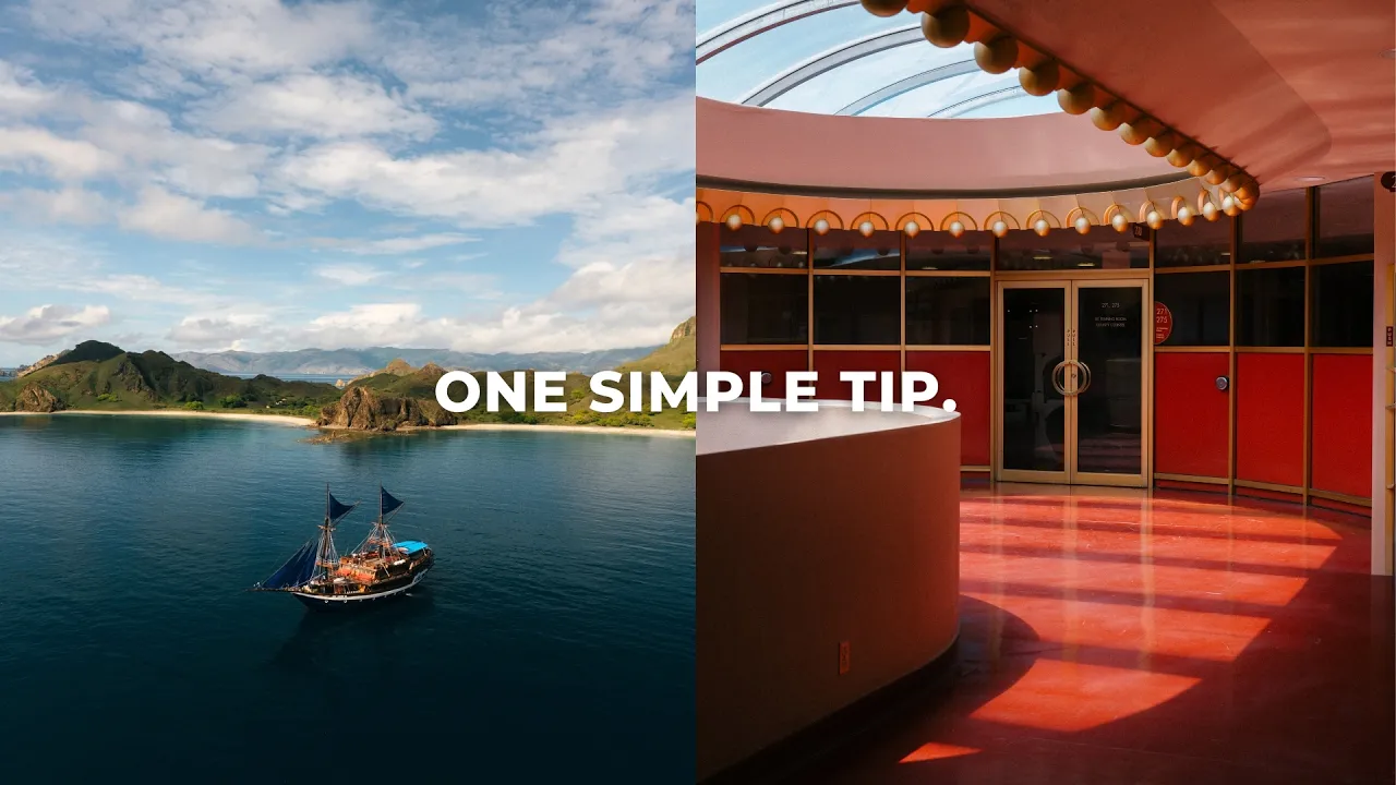
Give Me 15 Minutes and I'll Improve Your Composition by 86%
Photography Basics
Five common composition mistakes that are killing your images, and how to fix them.
·
9 min read

Composition is hands down one of the most important factors in photography. But it can also be a little abstract and difficult to understand. In this post, we're going to fix that by talking about five of the most common composition mistakes that are absolutely killing your images, and exactly how to fix them. Let's go!
READ OR WATCH: This blog post is also available in video form! If you'd rather watch me explain this content, simply watch the video below. Otherwise you can find the text guide below. Just keep scrolling!
In Give Me 15 Minutes and I'll Improve Your Composition by 86%, I break down each mistake using my own photos.
Why does good composition matter?
Good composition keeps your viewer looking at your photo longer, and it enhances the story your photo is telling. It guides the viewer's eye naturally through the frame and puts the emphasis on your subject, so the story comes through clearly instead of getting lost.
Okay, you might say good composition just looks good. And you'd be right! It's easy on the eye, and it makes you want to sit there and look at the image. Because of that, it keeps your viewer engaged, with their eye naturally flowing from one part of the photo to another without anything feeling too abrupt or uncomfortable.
I like to think of this as energy. You want to keep the energy inside the frame instead of letting it escape, because that's what keeps the viewer looking. Remember this idea of energy, because it comes up a lot in this post.
And perhaps most importantly, good composition enhances the story of your photo. We can use composition to emphasize our subject, or certain parts of our image, to tell a much deeper story. Ultimately, that's the most important thing in photography: the story your photo is telling.

So with that said, here are five common mistakes that might be working against all three of those things.
Mistake 1: Using leading lines incorrectly
You've probably heard of leading lines before. They're lines that guide us in and around a photo to keep the viewer engaged and keep the energy in the frame. But lines can also absolutely crush your composition. Where I see this happen most is with horizontal lines that lead us out of the image, instead of in, through and around it.
Take this shot of a train I photographed in Japan. When I saw it, I thought it would be such a cool photo. But instead of lines that lead me back into the image and keep me there, the horizontal lines on the train just pull my eye out to the left or the right, and there's nothing really anchoring the composition.

Now contrast that with this shot from Morro Bay (such a cool location, by the way). Yes, there are horizontal lines in this image. But your eye immediately locks onto the vertical leading lines in the sand, which all converge back onto the main subject: the giant rock in the back. Instead of leading you out of the image, they lead you in and settle on one point.

Leading lines are absolutely everywhere, in cities and in nature. So every time you're shooting, ask yourself: are the lines in this photo leading me in and around the composition and creating a natural sense of flow? Or are they leading me out of the image and sucking the energy out of the photo?
Mistake 2: No clear subject
Building off that idea of energy: if someone is looking at your photo and there's no clear subject, their eye will naturally hunt around the image looking for something to lock onto. When there's nothing there, they immediately lose interest and move on to something else.
A really clear subject anchors your composition and makes it easy for the viewer to know what to look at, which once again keeps the energy in the scene. The viewer sees your main subject first, hunts around the rest of the frame a little bit, and then settles back on that main subject. That's the flow we want to capture with composition.
There are a few ways to make sure your subject is nice and clear. You can go for a clean, minimal composition, which is something I often pursue in my photography. Or you can use lines, frames or depth to really keep the focus on your main subject. In this photo, the tree naturally frames the subject, acts as leading lines that converge onto them, and adds a sense of depth to the scene.

One of the biggest misconceptions with this tip is that you can only have one subject. That's not the case! You can totally have more than one subject, but your main subject should be very clear, and you can use secondary subjects to deliberately support it. Not only does that help balance out your composition, it can greatly enhance the story too. In this photo, the bridge is very clearly the main subject, but the birds add a ton of visual interest and help balance the frame.

Where I see this mistake most is in landscape photography. You think, "Oh, I'm going to go find a beautiful destination and shoot a photo because it's a really beautiful place." But if there's nothing anchoring you into the landscape, your eye hunts around, leaves the frame and loses interest immediately. Take this photo of a boat in the Komodo Islands of Indonesia. If the boat weren't there, this would be a super uninteresting photo, because there'd be nothing locking you into the scene. That's why one of the first things I look for in a landscape is a subject to anchor the composition.

I like to think about composition kind of like a song. If nothing catches your ear or pulls you into the track, you lose interest and change the song. So if some of your images feel busy and you're just not sure what to look at, oftentimes it's because there's no clear subject.
Mistake 3: Unbalanced compositions
The next mistake I see a lot of photographers making is shooting compositions that feel heavily unbalanced. One of the ways I like to think about balance is visual weight. Imagine every element in your scene has some weight to it. Larger and darker objects appear heavier, so it's important to include other elements on the other side of the frame to balance things out. Sometimes a simple crop is all it takes.
In this shot, the main subject (the bridge) is super, super heavy. But its shadow helps balance out the image by adding some visual weight to the bottom right of the photo.

The same goes for this image I shot in Morro Bay. The bottom of the photo feels very heavy because it's darker and denser, and there's a lot of negative space in the sky. But all the birds flying up into the sky really help balance out the composition, and they almost act as a leading line up to the bird in the top left corner of the frame.

So think about visual weight and balance. What's weighing down your composition? And is there anything else in the scene you can include to balance it out, so your viewer's eye can flow naturally through the frame?
Mistake 4: Focusing too much on the details
If you're too focused on all the little details in front of you, you're going to miss a lot of the compositional elements in the scene. One thing I like to do when I'm out shooting is purposefully unfocus my eyes, so I can better see the light, the shapes and the colors. That breaks the scene down into its most fundamental building blocks, and then you can compose based on that.
When you start doing this, I think you'll notice a lot of things impacting your composition that you might not have seen before, because you were too focused on the details. When I started doing it, I noticed that light was acting as a compositional element I hadn't seen before, and harsh light became a really core part of the compositions in a lot of my images.
Harsh light can create really strong diagonal lines that guide our eyes around the photo. It can help highlight our main subject, and it just looks super cool. I shot this photo in the small town of Lucca in Italy. The strong light on the left side of the frame helps balance the composition and frames the subject, and their shadows act as a leading line that brings your eye right back to them.

This one I shot at sunrise in Bali, inside the caldera of a volcano. The strong light cuts through the image and converges onto the main subject (the tree in the middle), and a bunch of little secondary subjects help enhance the story of the photo. I really love this shot.

So, in short: don't focus too much on the details. Yes, they're important, but so is the entire scene around your subject. Try unfocusing your eyes and notice all the shape, light and color, and how they impact the composition. If you want to go deeper on light, check out my post on how to shoot in harsh midday light.
Mistake 5: Shooting too zoomed in or cropping too tight
Last but certainly not least is shooting too zoomed in, or cropping too closely. I see this so much with beginner photographers who think the main subject is the only thing that matters in their photo. That couldn't be further from the truth, for two main reasons.
First, cropping too tight can make your composition feel cramped, and it doesn't give your subject any breathing room, which makes the photo harder to look at. Second, if you ignore everything around your subject, you might be missing out on a ton of storytelling elements.
So which of these is more compelling, the one on the left or the one on the right? Hopefully you said the right! It has a lot of really interesting negative space that frames the subject and gives it a lot of breathing room. On top of that, we get to see more of this beautiful beach in Indonesia, which makes for a much more compelling photo.

Same with this shot from the California coast. I was walking around and saw this Coke bottle with a rose coming out of it, and it was just such a vibe. But if I'd only focused on the subject, I'd be missing out on all the lines, shapes and colors around it that make the shot so much more interesting.

Now, I'm not saying you can't shoot zoomed in or with a telephoto lens. Some of my favorite images were shot at 200mm and beyond, and you can still include elements around your main subject when you shoot telephoto. Just think about all the elements in your scene and how they can enhance the story of your subject, and give that subject some space to breathe. That's why I like to use so much negative space in my photos. It just makes them a little easier to look at.
So, are these composition rules?
Nope! We covered a lot of compositional concepts in this post, but none of them are rules. There's no right or wrong in composition (or anything in photography, for that matter). There are preferences, though. In my experience, these are things a lot of people prefer to see in an image, myself included. If you avoid these mistakes, your composition will definitely level up.
Is there anything you think I missed? Let me know in the comments on the video. I read all of them! And if you want to keep learning, check out my posts on how to shoot with a 35mm lens and how to find your photography style. (A lot of the photos in this post were edited with my free Lightroom presets, too.)
Best of luck and happy shooting!
Want to go deeper on composition? I do a full deep dive into composition, plus everything else you need to know about taking beautiful images, in my Photography Essentials course.


Sean Dalton
Made with ☕ and a camera.