How to Edit Portraits in a Dark and Moody Film Style in Lightroom
Lightroom
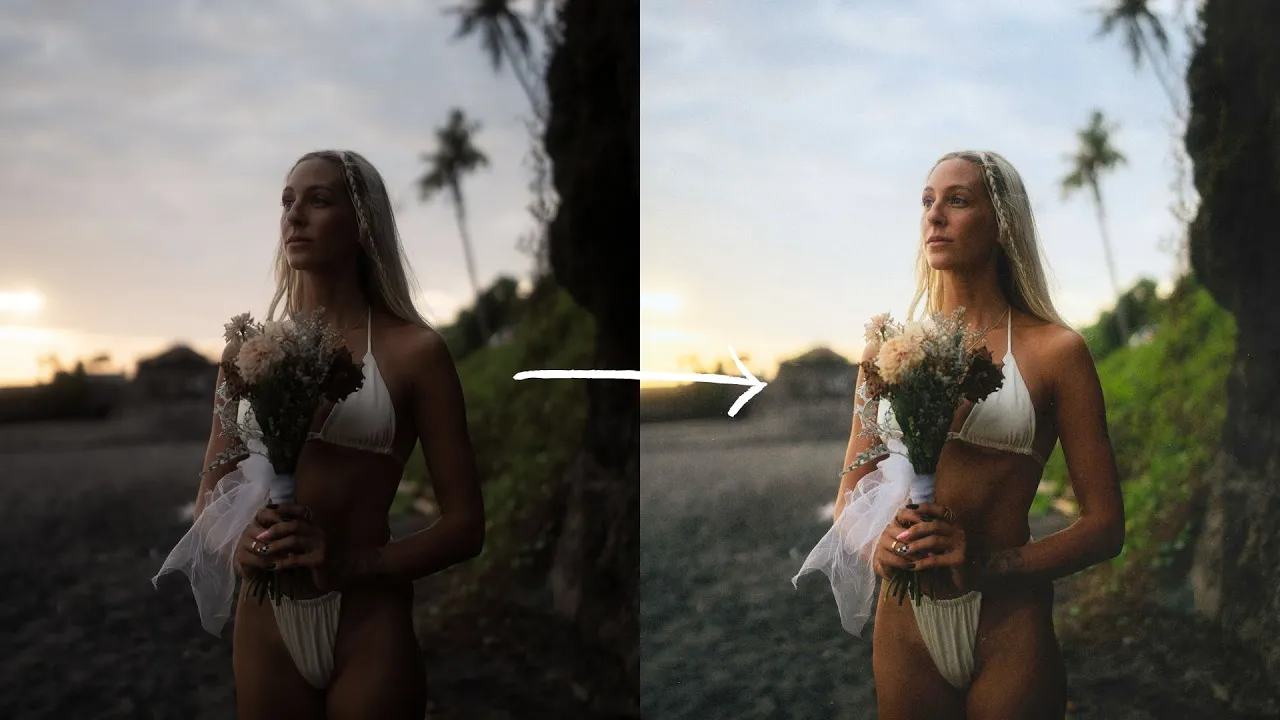
Here's exactly how I edit portraits in a dark and moody, cinematic film style in Lightroom, step by step, using photos from a portrait shoot in Bali.
·
10 min read

A few weeks before I made this, I did a portrait shoot with Kelsey in Bali, and you guys showed it so much love. So in this post, I want to break down how I edited those images in a dark and moody, cinematic film style. (Call it whatever you want, there are a lot of ways to describe it.)
Generally speaking, this editing style is a little softer in contrast while still keeping midtone contrast, plus a lot of playing around with the colors to get them dialed in. It had been years since I did a Lightroom editing breakdown, so we were overdue. Let's go!
READ OR WATCH: This blog post is also available in video form! If you'd rather watch me explain this content, simply watch the video below. Otherwise you can find the text guide below. Just keep scrolling!
In How to Edit Portraits in a Dark and Moody Film Style, I edit three photos from scratch in Lightroom.
Start with a photo that already fits the mood
I love this first photo, and it already kind of fits the vibe we're after. It's a little dark and moody already because I underexposed it a little, and Kelsey's pose really adds to the story. Editing is where we nail the vibe we were going for on the shoot.

Crop and clean up. First, I hit R to crop a little tree out of the corner. Then I hit Q and paint over a few little pieces of trash with the remove tool.
Step 1: Flatten the image in the Basic panel
In the Basic panel, I raise the exposure a little to give us more room to work with (we can always bring it back down). Then I nuke the contrast. I do that because I want to build the contrast in the tone curve, and a flatter image makes that a lot easier.

I leave the highlights, bring the shadows down a little to keep the dark and moody look, and leave the whites and blacks for now. I come back to the Basic panel quite a bit while I'm editing.
Lower the clarity. I reduce the clarity by around -5. I do this on pretty much all of my edits. I find too much clarity distracting, and lowering it lets you take the picture in as a whole.
Step 2: Build an S curve, then split it across the RGB channels
The tone curve has a massive impact on our images, because it lets us edit all the tones and some of the colors too. Here's how I use it to its maximum.
Make an S curve. You've got to hit them with the S curve. It looks like film and adds a lot of contrast while keeping midtone contrast. I hold Option and add three points for the shadows, midtones and highlights, then work each one: drag the shadows down for a moody look, nudge the midtones left a little, and bring the highlights up just a hair. You can raise the bottom left point to soften the blacks (I used to do this a lot, and still do a little) or lower the top right to soften the highlights.

The channel hack. Next, I right-click the tone curve, choose Copy Channel Settings, and paste them into the red, green and blue curves. The image looks crazy for a second, so I go back to the main tone curve, right-click and reset that channel. Now the contrast lives in the individual RGB channels, which means I can break it up by color.

Blues in the shadows. In pretty much all my edits, I like adding a little blue to the shadows, because I often shoot with a lot of shadow in the frame and love that color depth. In the blue channel, I hold Option for finer control and slowly drag the bottom left point up a little. It adds a really nice deep blue to the shadows and makes the greens lean a little blue. You can add some blue to the highlights too, but I don't want too much of that here.
Because the main RGB curve is now blank, you can still adjust the overall tones there. Want to soften the whites? Do a gentle reverse S curve on that first curve. Using every channel independently is a little hack I really like for dialing in the tones.
Step 3: Work through the Color Mixer
Now it's time to edit the color. In the Color Mixer, I work through hue, saturation and luminance independently, testing each color.

Hue. Red doesn't do much here, apart from Kelsey's lips. There's a lot of orange in her skin, so I push orange about +5, which complements the blues in the shadows. I drag yellow left a little to create color contrast between the hay and the green grass. The greens are already in a good place.
Saturation. I desaturate the yellows and greens a little. I used to absolutely nuke my greens, but as I've grown, I think they're beautiful when you dial them in. I bring a little color back into Kelsey's skin (around +3) so it stands out against the blues and greens.
Luminance. I raise orange a little to brighten Kelsey's skin, bring yellow up to add light and contrast in the background, and bring blue down to darken the sky and bring out a lot more detail in it.
Step 4: Cool it down, then warm it back up with Color Grading
Before touching Color Grading, I go back to the Basic panel and drag the temperature down to make the image bluer. One thing I like to say about Lightroom: there are so many ways to get a specific look, and the more features you use, the more color depth you get. I could just leave the temperature warm. Instead, I cool it off, then add warmth back in with Color Grading.
Warmth in the shadows. There's a lot of shadow in this image, so I hold Option and drag the shadows wheel toward warm, just a little. You can already see how much more color depth there is. You might not nail it right away. I play around until I find the shade I want, then slowly drag the warmth in.
Blue in the highlights. I add just a hair of blue to the highlights, which creates really nice complementary colors against the warm shadows. I also lower the highlights luminance slider, which adds a lot of softness to the sky behind Kelsey, and nudge the blending and balance sliders left a little to enhance the warmth.

Check it on different backgrounds. I right-click the background around the photo and switch between light gray, medium gray and dark gray. Dark gray works well for darker images, but on white, this one looked a little dark, so I raised the exposure and added a bit more contrast back in.
Calibration. Last, in Calibration I drag the sliders back and forth to see how they look. I added a touch of green back into the shadows and moved the red primary to about +4.
Step 5: Add grain
I always add grain to my photos, especially with a softer edit. A lot of old film photos have grain, especially underexposed ones, and if you ever soften your blacks like we did here, I highly recommend adding it. I drag grain to around 30 to 35, increase the size a little and play with the roughness. I'm not afraid to degrade the quality of my image, because I think it adds so much to the photo.

Copy your settings to the next photo
Once you've spent time dialing in one image, copy and paste the settings onto the next photo from the same shoot (or make a preset). I hit Cmd+C, select everything except Remove and Crop, then Cmd+V on the next image.
It'll look funky at first, because this second photo didn't need its exposure raised, so I drag the exposure down. I crop it to 8.5x11 (4x5 would cut off the tree) and adjust the Basic panel.
Separate skin from the sky. Kelsey is pretty bright in this one, and I want her skin to stand out against the dark sky. In the Color Mixer luminance, I bring yellow down to darken her skin a touch and create contrast with the sky, darken her hair a little, and reduce the saturation in her skin, which was a bit orange.
Darken the sky with a mask. I remove the trash again, then go to Masking and click Sky. Lightroom makes an amazing selection, and I just drag the exposure or highlights down to soften the background and pull detail out of the sky. This one hardly needed anything else.

One more edit from a different scene
This next one is probably one of my favorites from the shoot, from a slightly different scene. I don't crop it, but I paint out some trash in the background (it doesn't have to be perfect).
I raise the exposure to bring a lot more light onto Kelsey, since she's the subject, then bring down the highlights to keep the dynamic range, and lower the contrast to get ready for the tone curve. Instead of building the curve from scratch, I copy the tone curve from the first image and paste it here, reset the main curve, and fine-tune: soften the highlights, reduce the shadows a little, and lower clarity to about -5.
The image was lacking a lot of color, so Color Grading does the heavy lifting. I add warmth to the shadows (just a little, because it's strong), play with blue in the highlights, and experiment with the midtones. In the Color Mixer, I push orange to the right a little, push yellow toward green so the greens lean bluer, darken the sky with luminance, and brighten the oranges in Kelsey's skin.
Keep the focus on the face. To put the focus on Kelsey, I add a linear gradient mask over the bottom of the image and darken it, so the eye stays up top on her face. Then grain to tie it all together.

The final touch: a dust overlay in Photoshop
There's one last step I like to do to really tie images like this together and nail the mood. You need Photoshop, but I promise it's super easy.
Right-click the photo in Lightroom and choose Edit In > Edit in Adobe Photoshop.
Drag a film texture, dust or scratch overlay onto the photo. I get mine on Etsy. They're super cheap and you get a ton of them.
Stretch it to cover the corners, then set the blend mode to Lighten or Screen. Screen is stronger and really softens the image. Lighten worked better here.
Drop the opacity to around 50 to 60%.
It's really subtle, but it gives the photo such a vibe. I usually try a few overlays and settle on the one I like most, and for a series, I'll use a few different ones.

So, how do you edit dark and moody portraits?
Flatten the image and lower clarity, build an S curve and split it across the RGB channels, add blue to the shadows, work through the Color Mixer, cool the image down and warm it back up with Color Grading, add grain, and finish with a subtle dust overlay. Even when I'm editing in a different style, this is the workflow I follow. I'm constantly moving between the sliders, paying close attention to the colors and tones.
I think what makes a great editor is being very precise with every adjustment: paying attention to how each slider affects your image, and playing with the edit until you nail your original intention for that photo. If you want to see how I shot these, here's how to capture more creative portraits, and for my everyday process, here's my Lightroom editing workflow.
Happy editing!
Want to edit with this much intention? My Lightroom Masterclass has over five hours of super detailed editing lessons, breaking down not only how to use every single slider in Lightroom, but why you'd make each adjustment to your photos.


Sean Dalton
Made with ☕ and a camera.